Sunday, April 25, 2010

A great show

My web designer and good friend, Barbara DiLorenzo, runs a gallery in Ipswich, MA.


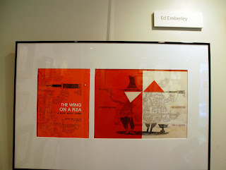
This month she had a children's book illustration show featuring the work of Mary Jane Begin, Pat Lowery Collins, Ed Emberley, Jarrett Krosoczka, Kristina Lindborg, Tom Palance, Julia Purinton, Andy J. Smith, and my own. I tried to include pictures of everyone's work, so I apologize if I've left anyone out.


She even featured the work of some very young aspiring artists.


Final EllRay cover?

So this is what the book designer at Viking did with the cover art I sent for the first EllRay book by Sally Warner. She said she might try some different colors for the "blast" - but I like this one a lot. Now I just have to wait a long, long time before I see a printed proof of the cover.


Thursday, April 8, 2010

Final EllRay cover art

It's hard to believe my part with the cover is done. I'm so happy and relieved. I can't wait to see what Nancy (book designer at Viking) will do with it next.


Thursday, April 1, 2010

Favorite new quill pen

I use a quill pen a lot in my ink and watercolor illustrations. For years, or as long as I've been illustrating, I used the very popular Speedball Crow quill holders and Hunt nibs. I used the "finest" nib (no. 104) because, surprisingly, it offered the most range in line width. I found that I could ink 2 full spreads before I needed to replace the nib with a fresh one. I dipped the pen into india black Calli ink (acrylic-based and waterproof) by Daler-Rowney.


But then, I was reading a book on making comic books (Making Comics: Storytelling Secrets of Comics, Manga and Graphic Novels by Scott McCloud) and there was a reference to some great-sounding inking supplies that are very popular among the Japanese Manga artists. After some hunting on the web, and research on some blogs, I learned about the Deleter brand of Japanese art supplies. The yellow pen holders, nibs and inks are hard to find (they're not sold at the big art stores like Blick, Pearl, Cheap Joes, for example) but I have found them on-line at BlueLine Pro Art Supply and the new Deleter on-line Manga shop.


There are three kinds of nibs. I've only used the G-Pen nib, but I plan on trying the other two. The Maru-Pen nib is used for drawing thin lines and the Saji-Pen is used to draw "...a variety of lines with pen pressure control." The nibs are great because they're so flexible, yet sturdy too - they last such a long time.


Deleter has black and white inks too. Actually there are 6 blacks and 2 white inks available. Some blacks are waterproof, some aren't, some are dry matte, some are glossy, etc., I've used the #3 ink and it's worked great. It's important, I read in a blog, to use the Deleter inks as opposed to other inks because they may be too thick for the nibs.

I've recently learned about a new brand of Japanese nibs called Zebra. They're supposed to be the Excalibur of nibs so I think I need to try them next.

Saturday, March 27, 2010

EllRay covers continued...

I'm still working away on the cover for EllRay Fights Back (2011), the first book in the new series written by Sally Warner and published by Viking. As I said in an earlier post (2/16), making the first jacket in a series can be a challenge and this one had been no exception. I'm down to the inking part. At this point, I have done several inkings, but I think, we've finally got a winner.

In the one below, the feedback was that the boys looked too feminine...too much wild hair. I guess Jared's hair (boy on left) could be interpreted as wavy.


In the next one, the feedback from Viking was that EllRay (on right) looked "too old" his face was "too long" and his hair was a "triangle".


This one made the cut.

It's amazing to me, still now after years of sketching, how I can copy a single sketch over and over and every single time it looks slightly different. Once more, the smallest change in a line can completely change a character's expression or the overall feeling of an image.

Now it's time to paint.

Sunday, March 21, 2010

Taking time out

I try to go to the library or a local bookstore every few months to look at picture books. I prefer to go to a bookstore because I love seeing the latest books. Wellesley Booksmith in Wellesley, MA is usually where I go—they have a fairly large childrens book section, the books are well-organized and the staff is terrific (especially if you're looking for recommendations). Also, they have a lot of author and illustrator events throughout the year with very well-known artists.

However today I went to the Concord Bookstore in Concord, because there's a delicious ice cream store nearby, Bedford Farms, and I wanted my girls to come along. In the bookstore, I pretty much follow the same routine...go through all the shelves and pick out books that look interesting. Then I find a spot to sit and read through each one, page by page. I study the books as if it were a rare artifact. Endpapers are one of my favorite parts of a book and I love to read how the illustrations were created—it really bugs me when that information isn't included in the copyright page.

Today, I probably read 15 picture books in all. I found 6 that I really liked, but for different reasons...sometimes it's the art, sometimes it's the story, sometimes, though rarely, it's both.


My youngest daughter loves the chapter books by the Klise sisters so I was interested in reading their new picture book. The story of Little Rabbit and the Meanest Mother on Earth by Kate and Sarah M. Klise is original and I particularly liked the Mother's solution at the end. The illustrations are bright and busy.

Oliver Jeffers is one of my favorite illustrators. He has an amazing way of manipulating watercolor into very flat, contemporary shapes. His characters are unusual looking, very unique. I love their stick legs. He's also amazing at mixed media (check out the The Incredible Book-Eating Boy). In this book, he incorporates scanned photographs of seascapes and then overlays original art on top. He does it on just three pages but it works so well. Be sure to take time with the "thought bubbles" — there's so much going on each one. I find that every new book Jeffers does, offers something new and his storylines are original.

The latest one, The Heart and the Bottle, is a very sweet, poignant tale. Actually, it would be a nice gift for someone who has suffered the loss of a loved one. His "illustration note" (on copyright page) made me smile..."The art for this book was made from all sorts of stuff. Some watercolor, some bits from old books, some gouache, a little amount of technology, some acrylic and even a bit of house paint. I think here is some oil paint on one page. But that might have been an accident." Oh, and don't forget to take off the jacket and look at the book cover.

The Quiet Book by Deborah Underwood and illustrated by Renata Liwska is terrific—I love the concept of this very simple book. It perfectly highlights different moments of "quiet" - not just the quiet when there's no sound. It really makes the reader think..."Top of the roller coaster quiet" and "First look at your new haircut quiet" and "Swimming underwater quiet" and my favorite, "Lollipop quiet". The illustrations feature a cast of different animals. The book demonstrates the perfect balance between words and pictures, where both are equally telling the story. I wish I wrote this book.

I'm not a huge poetry fan, but I love the art in Douglas Florian's, Poetrees. He rendered the spreads on primed brown paper-bags (with gouache, watercolor, colored pencil, rubber stamps, oil pastels, and collage). How cool is that? You can see the creases from the paper-bags in the pictures. The book is beautifully designed to reinforce the content of the book by having vertical double-page spreads, as opposed to the traditional horizontal spreads. I bought this for a friend of mine for her birthday.

The rhyming and terrific word play makes Big Chickens Go To Town by Leslie Helakoski and illustrated by Henry Cole for a terrifc read-a-loud. The chickens have so much personality.

And finally, I loved the artwork in Extraordinary Pets by Barroux. Stephane Barroux is an accomplished French illustrator. He's only illustrated a handful of children's book here in the states but hopefully that will change. I love the mix of media especially his use of linocuts.

Friday, March 19, 2010

New flat files

Yahoo!!! My new flat files arrived today. Getting them into my basement was such an ordeal but we finally did it. I took out the drawers which made each cabinet (one is stacked on top of the other) much lighter to carry. I bought them on Ebay which was a huge risk - just relying on pictures from the website and customer reviews. But the price was right. They're very nicely made, solid, sturdy, and I think they will hold my artwork, watercolor paper, etc., for a long, long time. If you're looking for flat files check out Ceanna Rita's Treasures.

Now I just have to organize everything that goes inside. Ugh.